[03] Mrs. Kelly's Tea Website Redesign

Project Overview
Role: UX/UI Designer
Timeline: 8 Weeks
Target Users: Tea drinkers, online shoppers, and customers discovering Mrs. Kelly’s Tea for the first time
Focus Areas: Website Navigation, User Flow, Homepage Redesign, Product Page Redesign, Information Architecture
Mrs. Kelly’s Tea is a local tea business whose website needed clearer navigation, improved information architecture, and a more intuitive shopping experience. As a group, we focused on redesigning the homepage and restructuring the primary user flow to help users quickly understand the brand, browse products, and move toward purchase with less friction.
In addition to the group scope, I independently redesigned the product page to improve product discovery, readability, and decision-making by emphasizing clear hierarchy, product details, and calls to action.
Background
Mrs. Kelly's Tea is a Minneapolis-based wholesale tea leaf supplier, offering loose leaf tea to both businesses and individual customers in the downtown area
User-Focused Goals
-
Simplify shopping, searching, and buying.
-
Explore and enjoy unique tea culture.
-
Access info about offline events quickly.
-
Understand the brand’s services clearly.
Business-Focused Goals
-
Strengthen Mrs. Kelly’s Tea’s brand identity.
-
Increase customer engagement, satisfaction, and conversions.
-
Boost online transactions.
-
Create a human-centered design for local business growth.
UX Research
Before redesigning Mrs. Kelly’s Tea website, we need to understand the U.S. tea market, user motivations, and online purchasing behaviors through background research, competitive analysis, and user interviews.
Why it matters?
-
In 2023, Americans consumed almost 86 billion servings of tea, or close to 4 billion gallons (Tea Association Fact Sheet, 2024).
-
Most tea consumption centers on familiar options like black and green tea, indicating the need for clear explanations to support exploration of less familiar varieties (U.S. Census Bureau, 2024).
-
Many users choose tea for its perceived health and wellness benefits, such as antioxidant and anti-inflammatory properties, making it important to present these benefits clearly within the digital experience (Harvard Health, 2025).
| Competitive Analysis
We analyzed existing tea e-commerce websites to identify common patterns, usability issues, and opportunities for improvement.
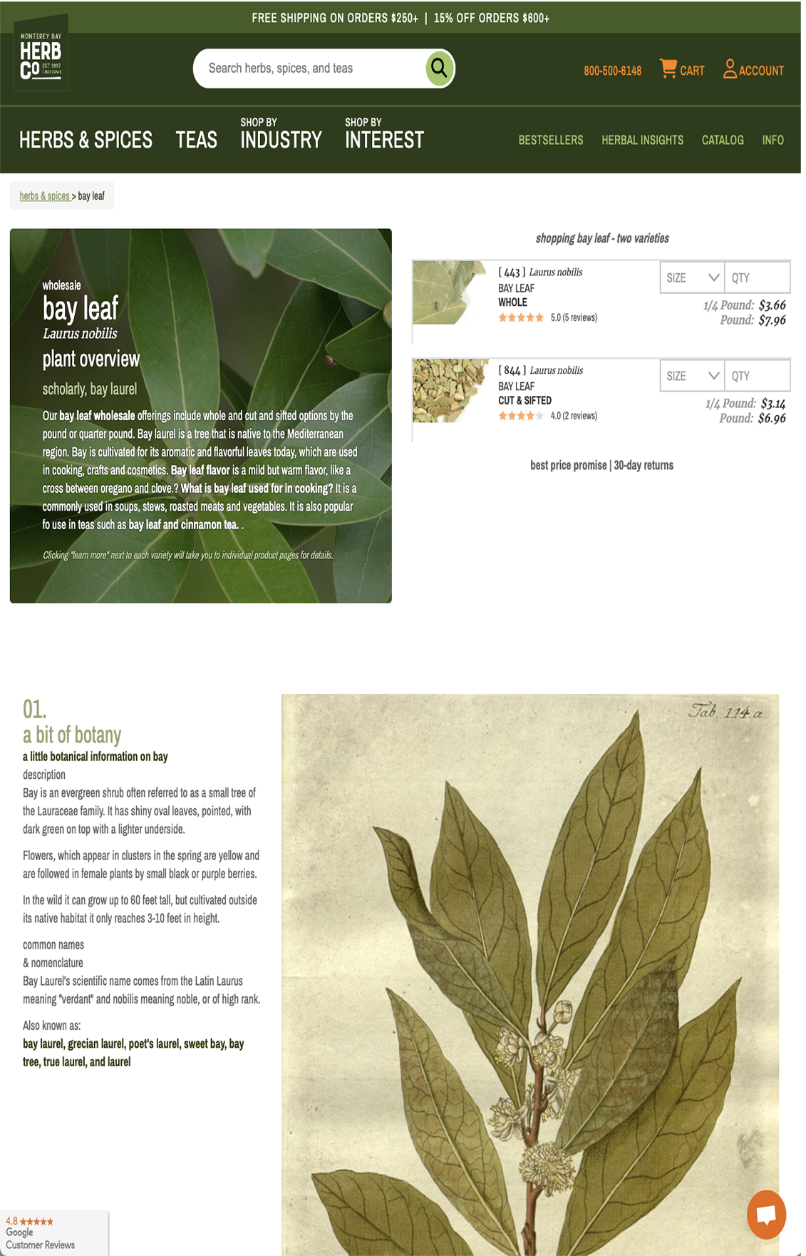
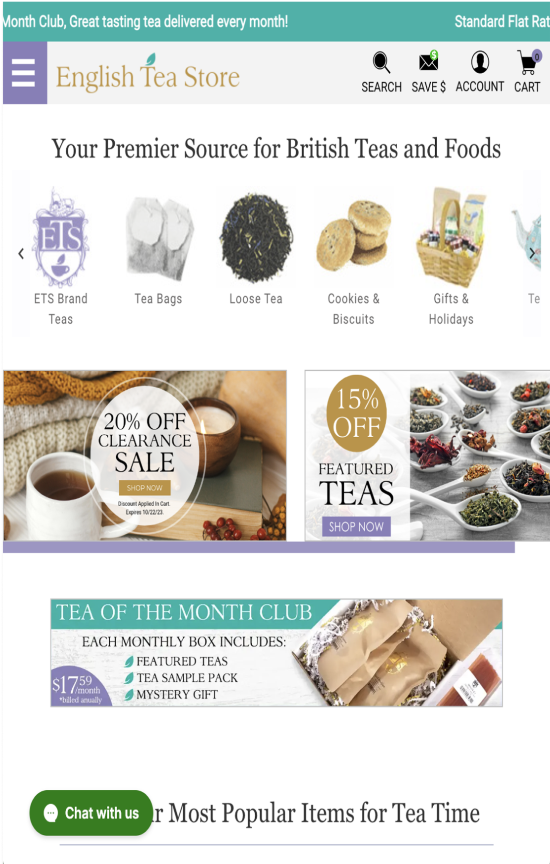
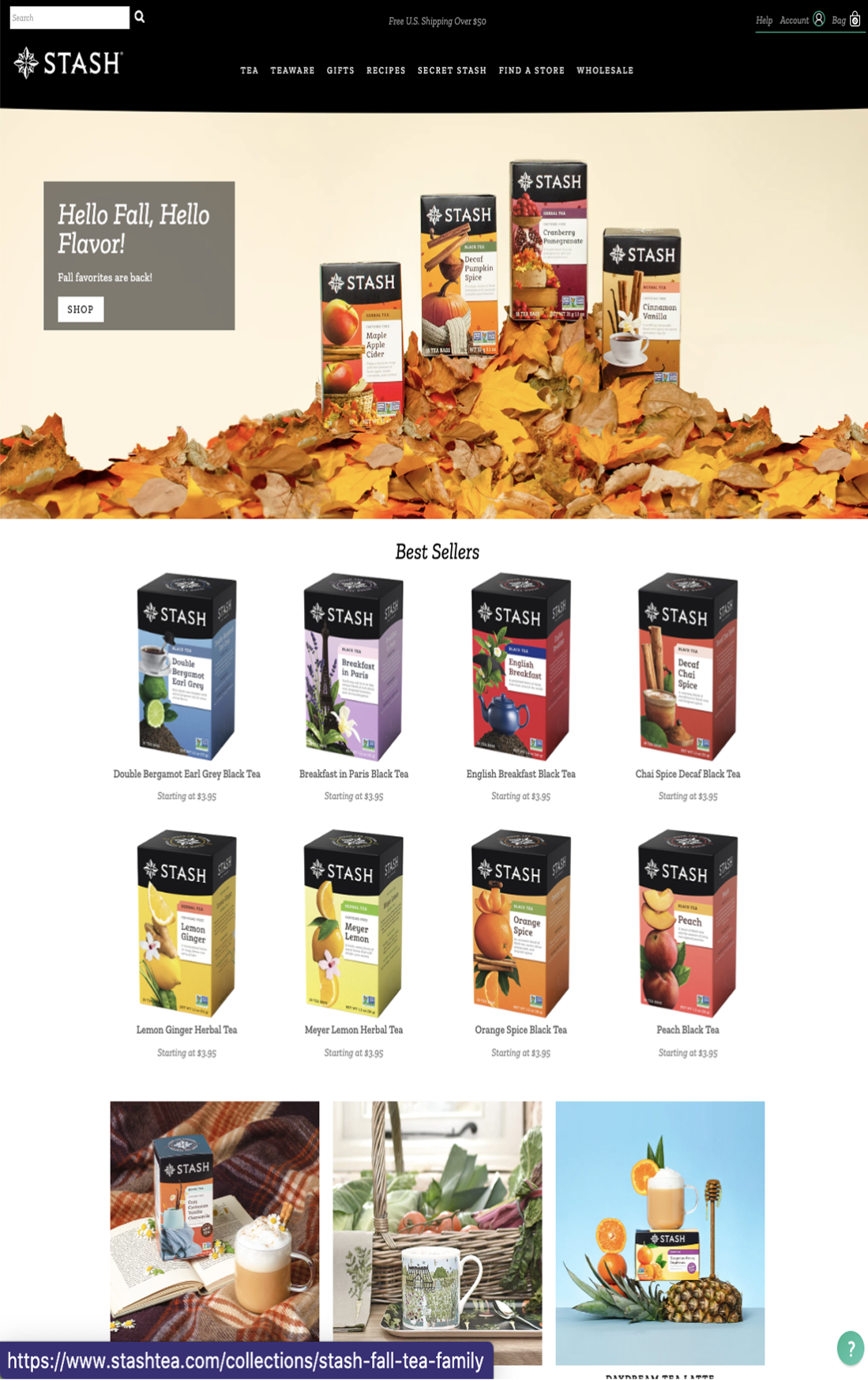
Advantages (+)
-
Showcased featured products
-
Cohesive color palette
-
Abundance tea varieties
-
Consistent product background by type
Disadvantages (-)
-
Too many different font sizes and too big
-
Overwhelming navigation
-
Footers too stretched
-
Not informative on tea benefits
| User Interviews
We conducted interviews with 6 participants to explore how often they drink tea, what types of tea they prefer, and the environment, mood, and experience they associate with tea consumption, and their overall impressions of the current Mrs. Kelly’s Tea website.
Elvin T.
Andy L.
Vy B. N.
Pahoua X.
Jason D.
Hannie M. L.
Here's what we found:

Examining the Current Website
The current Mrs. Kelly’s Tea website is unorganized, lacking the simplified features that users expect from an e-commerce experience. Navigation is confusing, making it difficult for customers to easily browse products or understand the company’s offerings. Additionally, the website fails to clearly communicate Mrs. Kelly’s mission and the unique value of the products, leaving users with an unclear understanding of the brand and its purpose.
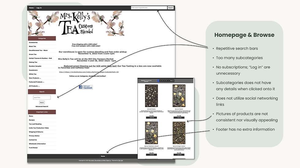


Site Map and Wireframe Process
For the final site map, to have a better navigation experience, we have carefully organized and prioritized the sections based on their importance, determining which content should be highlighted and which would be more effective in the footer.

| Wireframe Process
To start our brainstorming on which wireframe layout would look the most appropriate for the homepage, we sketched 3 different wireframe sketches and analyzed the benefits and disadvantage of each.

Then we proceeded with creating the "mild" and "wild" medium-fidelity wireframes as the basic wireframes, we thought, wouldn't help the website stand out amongst their other competitors.


Crab Udon Soup
Prepping the broth
Chop mushrooms, cilantro, scallions, carrots, pork belly, shallots, and onions on a wooden cutting board, then gather all the chopped ingredients into a bowl.
2 Hr 8 Mins Left
Instructions
Ask me anything...


Crab Udon Soup
Prepping the broth
Mix paprika, onion powder, garlic, white pepper, salt, sugar, sesame oil, fish sauce, soy sauce, and hoisin sauce together in the same bowl.
1 Hr 48 Mins Left
Instructions
Ask me anything...

Crab Udon Soup
Meat Topping
Heat a frying pan over medium heat and cook all the meat topping ingredients until they are crispy and golden brown.
1 Hr 34 Mins Left
Instructions
Ask me anything...
okie thanks homie!
Does it matter which item I cook first?
Cook the ingredients in the following sequence: mushrooms first, then carrots, followed by eggs, and finally, crab meat.
1 Hr 21 Mins Left
Instructions
Crab Udon Soup
Meat Topping
User Testing
After sharing our first UI design draft with over 30 people, we organized the feedback into three categories:

Here are the UI design revisions based on feedback from our user testing:
Before - Hero Page
Final - Hero Page


Before - 3 Steps Guide
Before - 2nd Revision
Final - 3 Steps Guide


Before - Review Page
Final - Review Page


Wireframe to Final Design
We decided to move forward with the "wild" wireframe because we believe a more immersive and interactive homepage with carousels, educational content, and product advertisements will enhance user engagement and make the website stand out.
Here's the final high-fidelity wireframe to UI design:

Educational sections highlight the relevance of tea and its benefits to customers.
Action buttons like "Shop Now" or "Learn More" improve UX by guiding users, boosting engagement, and increasing conversions.
Customer reviews showcase reliability, product quality, and help build a strong community around the business.
@shayayeaye1
Sous Chef
Shayla Taylor
Joined: March 1, 2024
48 Dishes Cooked
Master Chef
Chef de Cuisine
Sous Chef
Commis Chef
Chef de Partie
Kitchen Apprentice
Novice Newcomer
Reward System
My Rewards
Peanut allergies
Lactose intolerant
Hates any sauces
Preferences
Soy allergies
Hates spicy foods
Loves seafood
0/1
1/3
Sous Chef: Pick 5 weekly
50% off any dish groceries (Up to 5 servings)
Free delivery
2/5
1/3
$10 off groceries
25% off at checkout
0/3

2 free mystery ingredients


A clear, simple backgrounds photos to ensures customers know exactly what they're purchasing while making shipping and returns information easily accessible for a hassle-free shopping experience.
Detailed insights on why Mrs. Kelly’s Tea stands out, including the types of tea in each products and their unique benefits.
In the case of China Rose Tea features a black tea base, allowing customers to scroll and learn about its specific benefits and characteristics.

A clean white background keeps the product images professional and makes them stand out against scenic photos.
A minimalistic hero design enhances the bold statement title while evoking a luxurious and calming ambiance.
A carousel feature highlights top products, including best sellers and highly rated teas, with brief descriptions to engage customers.
Consistent color schemes in educational sections highlight the beauty and essence of tea.
Having similar Illustrations can maintain a unified theme throughout the website, enhancing cohesion and sparking user interest.
Displaying real buyer testimonials and providing a space for reviews enhances trust and credibility for the business website.
Visual illustrations highlight key product features and benefits, helping buyers determine if it meets their needs.
Real-life product photos and customer testimonials provide buyers with confidence and assurance in their purchase.

Showcasing and recommending related products with similar images and backgrounds ensures the site remains cohesive and consistent with its theme.
Educational sections highlight the relevance of tea and its benefits to customers.
Action buttons like "Shop Now" or "Learn More" improve UX by guiding users, boosting engagement, and increasing conversions.
Customer reviews showcase reliability, product quality, and help build a strong community around the business.
@shayayeaye1
Sous Chef
Shayla Taylor
Joined: March 1, 2024
48 Dishes Cooked
Master Chef
Chef de Cuisine
Sous Chef
Commis Chef
Chef de Partie
Kitchen Apprentice
Novice Newcomer
Reward System
My Rewards
Peanut allergies
Lactose intolerant
Hates any sauces
Preferences
Soy allergies
Hates spicy foods
Loves seafood
0/1
1/3
Sous Chef: Pick 5 weekly
50% off any dish groceries (Up to 5 servings)
Free delivery
2/5
1/3
$10 off groceries
25% off at checkout
0/3
2 free mystery ingredients
Reflection & Key Takeaways
My Key Takeaways
-
Tea websites must highlight health benefits and product education beyond standard e-commerce sections.
-
Educational sections help tea brands stand out by informing customers about tea types and benefits.
-
A consistent color scheme with well-chosen contrasts enhances the natural tones of tea.
-
The hero section needed to make a strong impression while staying luxurious and calming.
Next Steps
-
Create a dedicated page to share the story behind Mrs. Kelly’s Tea and its mission.
-
Add e-commerce promotion banners on the landing page to boost engagement and highlight special offers.
-
Design a browsing page showcasing all tea products and accessories for easy navigation.