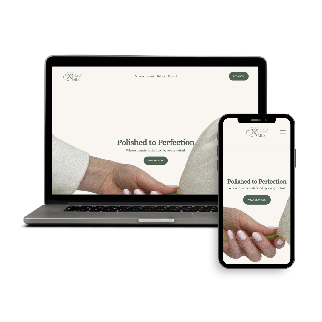
[01] Polished Nails
).png)
Project Overview
Role: UX/UI & Website Designer
Timeline: 2 months
Target Users: Prospective Nail and Lash Clients
Focus Areas: Website Design, User Experience, Brand Presence, Responsive Design
Polished Nails is a local beauty salon offering nail services while expanding into lashes, hair, and professional makeup. Without a dedicated website, potential clients relied primarily on social media to learn about services, making it difficult to find information, explore previous work, and connect with the business.
This project focused on creating the salon's first digital presence, helping clients discover services and connect with the brand.
The Challenge
Polished Nails was a newly established beauty salon preparing to launch its services. As a new business, it needed a professional website that could introduce the brand, communicate its offerings, and establish credibility with potential clients from day one.
Key Challenges
-
No existing digital presence
-
No established brand identity online
-
Need to communicate multiple service offerings clearly
-
Need a scalable website structure to support future growth
How do we create a clear and trustworthy first impression?
Define the Website Goals
Before designing the website, I worked to identify what the business needed to communicate and what information potential clients would need when visiting the site for the first tim
Business Goals
-
Establish a professional online presence
-
Introduce the salon's services and expertise
-
Build trust with potential clients
-
Create a foundation for future business growth
User Goals
-
Learn about available services
-
View examples of previous work
-
Understand the salon's offerings
-
Easily find contact and booking information
Competitive Analysis

(+) Great color scheme; images blend well with the overall design.
(+) Intuitive navigation and responsive, adaptive screens.
(-) Pricing is not transparent.
(-) Many images appear unrealistic, resembling AI-generated or stock photos.

(+) Gallery features real, watermarked photos of completed work.
(+) Prices are clearly listed for all services.
(-) Most services lack descriptions, and the "pedi/mani" wording is confusing since the descriptions only cover pedicures.
(-) The homepage hero section repeats the city location in bold three times, which feels unnecessary.

(+) Includes plenty of visuals, including photos and videos.
(+) Highlights credentials, awards, and social media presence.
(+) Lets users toggle service prices between cash and card payments.
(-) Some sections contain text that feels AI-generated and doesn't blend naturally with the rest of the page, making the content feel less authentic.
Mood Board
My client wanted the website's first impression to feel luxurious, clean, refreshing, minimal, and bright. To help visualize the direction, I created several mood boards showcasing different design styles. In the end, they chose Option 1 with a few elements from Option 2.


Logo Branding


Logos that didnt make it
User Flow
.png)
Final Design
Guided by the user flow map, mood board, and website goals, I designed and built the Polished Nails website using Squarespace.
Homepage


Note: Images have been zoomed and adjusted to fit the page, so some text and visuals may appear smaller in the screenshots. The video provides the most accurate representation of the website's actual size and layout. Please click on the images to enlarge them for a better view!
Services Page


Note: Images have been zoomed and adjusted to fit the page, so some text and visuals may appear smaller in the screenshots. The video provides the most accurate representation of the website's actual size and layout. Please click on the images to enlarge them for a better view!
About Page


Note: Images have been zoomed and adjusted to fit the page, so some text and visuals may appear smaller in the screenshots. The video provides the most accurate representation of the website's actual size and layout. Please click on the images to enlarge them for a better view!
Gallery Page


Note: Images have been zoomed and adjusted to fit the page, so some text and visuals may appear smaller in the screenshots. The video provides the most accurate representation of the website's actual size and layout. Please click on the images to enlarge them for a better view!
Contact Page


Note: Images have been zoomed and adjusted to fit the page, so some text and visuals may appear smaller in the screenshots. The video provides the most accurate representation of the website's actual size and layout. Please click on the images to enlarge them for a better view!
Reflection & Key Takeaways
This project with Polished Nails was my first freelance experience working with a real client, and it taught me that good design is just as much about communication as it is about visuals. Unlike presenting to design students who understand design terminology, I had to explain my decisions in a way that was clear and relatable, helping my client understand the reasoning behind the website's content, layout, and overall direction. This experience strengthened both my design and client communication skills, and it inspired me to reach out to more local businesses to help them build or redesign their websites!